This is my finished Digipak. I have inverted my front cover to create a better contrast over the digipak and I have re-created this style on my inside panel (bottom-left) inserting the convention of thankyou's. This keeps with the style and the colour scheme and in particular makes the white writing stand out more ontop of the black than the other way round. I've also created my own record label "Counter Records". Taking insipration from "Dominos" a company that publish Arctic Monkeys records (a similar genre), this is appropriate because they have to relate to be realistic.
Now with my new front cover I've started to develop the rest of my digipak. Using stills from my first music video filming session I have started to create a photo collage to go across the inside left and right panels. This could be used across the back of the CD panel and myabe if white lines were introduced along the adges of the photo's this would look more proffesional. I'm not sure about the front cover being white with black text so this could be inverted to suit the rest of the digipak better.
I think this makes the product look more professional and less busy. Because of this I think it makes product stand out much more, in particular the text stands out and with this product being a main feature of an advertising campaign it's specifically suitable.
With this design I have decided to try and take inspiration from my digipak front cover trying to make them connect through aesthetics and idea's. I am undecided on whether the small words need to continue throughout the poster or like now stop to allow the review and date to stand out. Either way I think this is the right direction for my poster. Its also a possibility that the poster would still look effective and pleasing without any small words so this is another direction I need to explore.
This is my finished front cover design, It may need more work dependant on the feedback I receive but I'm happy that It conveys my band and their style in the right way, this now needs to be related to the rest of my Digipak which will require me to make some changes to my draft but not as drastic as this. The Title's have been placed in those specific positions because of the Golden Spiral Theory and my knowledge of the "Z" format. The golden spiral rule shows that consumers attention starts in the top left hand corner of the page then spiralling outwards, therefore I have placed the Artist name in this top hand corner (being the most important piece of information) so this is seen first. The Out of Dreams title is influenced more from the "Z" format in which elements are placed along these lines for eye attention of the target market and therefore this seemed appropriate whilst also being aesthetically pleasing for its placement.
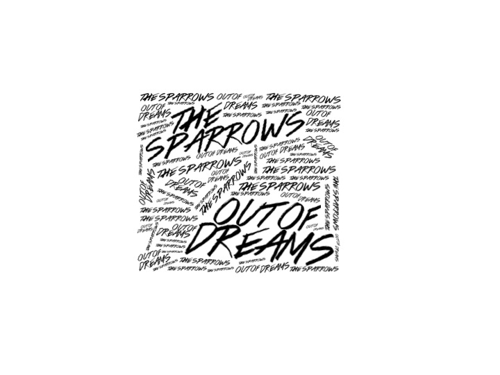
I think the development on Design 3 is going successfully. The use of the scribble like font makes the idea look aesthetically pleasing but improvements could be made. I think the top quarter looks much more precise and pleasing than the rest and I think this is because of the more linear small text which is something I should consider for the rest of the cover.

After receiving some feedback about my digipak and finding that most of this mentioned that it represented the punk genre instead of Indie Rock I thought that when developing the image and style of font needed to be changed. Also with my own photo shoot needing to be organised I found that none of my actors were available together and if they were it was for a short period of time, for this reason I've attempted to design some new front covers for my digipak influenced by minimalism and word orientated front covers. I think the First design looks far to Gothic and out of character with the genre whereas the second design looks much more like something associated with it. It still looks dark and emotional however which doesn't really relate to the track listing but maybe with colour it could look effective. I particularly like my third design which is very similar to that of Paramore's "RIOT" album but instead of being colour based to make certain words stand out it uses Size, I think this could be an effective album cover because the font relates to the genre, look and age of my band whilst it also has the potential to be extended for a Poster. The third design does however need more development with the placement of the album name and smaller font sized words.