Friday 30 November 2012
Influence - Editing
Whilst editing my final version of my music video I've taken inspiration from Blur's Song 2 music video in which they deliberately slow down the music video by lengthening and decreasing the amount of shots during verses and then increasing and shortening shots during the chorus and breakdown. This is something I'm trying to recreate in my music video.
Thursday 29 November 2012
Sunday 18 November 2012
Re-Filming Evaluation
To overcome the technical issues that arose last time after filming I have prepared the camera to the right settings and have also made available the right software for me to be able to convert my film files ready for editing via iMovie.I think my re-filming went allot better than my original filming as I was much more prepared and organised. I was also much more time efficient taking into account the number of shots I needed to do and how long each one would take which allowed me to have extra time to film more footage experimenting with different shots, angles and height. These shots were drum instrument orientated, this is because the drum shots offered and would add more movement and pace to my video and there were to many repetitive shots in my animatic (of the drummer). To overcome the technical issues that occurred last time after filming I prepared the camera to the right settings before hand and also made the correct software available for me to be able to convert my film files for editing via iMovie.


Friday 16 November 2012
Development Of Digipak
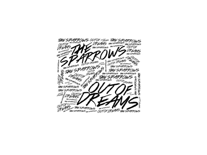
This is my finished Digipak. I have inverted my front cover to create a better contrast over the digipak and I have re-created this style on my inside panel (bottom-left) inserting the convention of thankyou's. This keeps with the style and the colour scheme and in particular makes the white writing stand out more ontop of the black than the other way round. I've also created my own record label "Counter Records". Taking insipration from "Dominos" a company that publish Arctic Monkeys records (a similar genre), this is appropriate because they have to relate to be realistic.

Friday 9 November 2012
Digipak Development

Thursday 8 November 2012
Development Of Poster Design 2
I think this makes the product look more professional and less busy. Because of this I think it makes product stand out much more, in particular the text stands out and with this product being a main feature of an advertising campaign it's specifically suitable.


Development Of Poster Design
With this design I have decided to try and take inspiration from my digipak front cover trying to make them connect through aesthetics and idea's. I am undecided on whether the small words need to continue throughout the poster or like now stop to allow the review and date to stand out. Either way I think this is the right direction for my poster. Its also a possibility that the poster would still look effective and pleasing without any small words so this is another direction I need to explore.


Wednesday 7 November 2012
Final Digipak Front Cover Design

Tuesday 6 November 2012
Developing New Digipak Design
Changes To Digipak

Subscribe to:
Posts (Atom)