Tuesday 11 December 2012

Evaluation Question 2 DRAFT - How effective is the combination of your main product and ancillary texts?

I decided to try and cross-converge features across my product and texts so the audience could see common features amongst them, which would subsequently, give branding to my band. Real bands such as Arctic Monkeys, The Black Keys and others in very different genre's such as Enter Shikari and JLS use strategies like these to make their bands/groups more successful by creating recognition images. For example I have decided to use the same font and placement across my products, having the scrawny scribbled text on the front cover similarly done on my poster and introducing the music video. This makes the font seemingly have a clear relationship with the artist, and if seen somewhere on posters or other marketing products the audience can quickly relate them to each other therefore giving presence to its consumers. Paramore's front cover of the album "Riot" allowed for recognition from many different audiences because it became iconic. This is something I've tried to develop through my digipak but had also decided not to have this repetition on my other products. This is because the design was slightly different from the original iconic one and I wanted the text font to be the main attraction or representation of the band so in reality this could be used in future products of the artist and this therefore is much more convenient. 

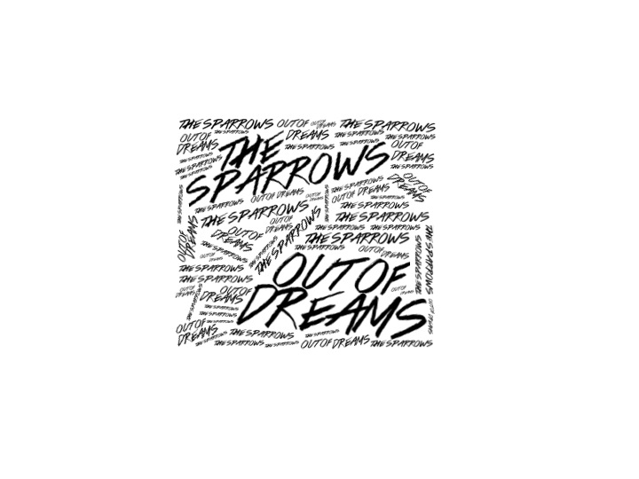
I decided to use a black and white colour scheme throughout my product and ancillary texts because I also wanted the colour scheme to converge through them. This also relates to the idea of "branding" as this aids to the audience grasping the connection between the products. I decided when doing this to have my poster in versed from the digipak colour whilst looking allot brighter than the music video so it could stand out when advertising in local music shops and other amenities. Thinking back I think the product would be more effective in versed to the black background and white text because the important text would stand out and would look much more combined and related to my digipak and music video. My music video obviously relates to my digipak as stills from other practise filming sessions are displayed as a collage across my inside panels which to my audience is an interesting feature.

Overall I think my products all combine well using the same features and colour scheme's, but some could be changed to improve the branding effect of the artist. The ancillary texts successfully relate to my music video and features such as text of my ancillary texts to the quick, snap like shots of my music video relate well and show a consistency across my products.

Friday 30 November 2012

Influence - Editing


Whilst editing my final version of my music video I've taken inspiration from Blur's Song 2 music video in which they deliberately slow down the music video by lengthening and decreasing the amount of shots during verses and then increasing and shortening shots during the chorus and breakdown. This is something I'm trying to recreate in my music video.

Sunday 18 November 2012

Re-Filming Evaluation

To overcome the technical issues that arose last time after filming I have prepared the camera to the right settings and have also made available the right software for me to be able to convert my film files ready for editing via iMovie.I think my re-filming went allot better than my original filming as I was much more prepared and organised. I was also much more time efficient taking into account the number of shots I needed to do and how long each one would take which allowed me to have extra time to film more footage experimenting with different shots, angles and height. These shots were drum instrument orientated, this is because the drum shots offered and would add more movement and pace to my video and there were to many repetitive shots in my animatic (of the drummer). To overcome the technical issues that occurred last time after filming I prepared the camera to the right settings before hand and also made the correct software available for me to be able to convert my film files for editing via iMovie.


Friday 16 November 2012

Development Of Digipak


This is my finished Digipak. I have inverted my front cover to create a better contrast over the digipak and I have re-created this style on my inside panel (bottom-left) inserting the convention of thankyou's. This keeps with the style and the colour scheme and in particular makes the white writing stand out more ontop of the black than the other way round. I've also created my own record label "Counter Records". Taking insipration from "Dominos" a company that publish Arctic Monkeys records (a similar genre), this is appropriate because they have to relate to be realistic.

Friday 9 November 2012

Digipak Development

Now with my new front cover I've started to develop the rest of my digipak. Using stills from my first music video filming session I have started to create a photo collage to go across the inside left and right panels. This could be used across the back of the CD panel and myabe if white lines were introduced along the adges of the photo's this would look more proffesional. I'm not sure about the front cover being white with black text so this could be inverted to suit the rest of the digipak better.

Thursday 8 November 2012

Development Of Poster Design 2

I think this makes the product look more professional and less busy. Because of this I think it makes product stand out much more, in particular the text stands out and with this product being a main feature of an advertising campaign it's specifically suitable.


Development Of Poster Design

With this design I have decided to try and take inspiration from my digipak front cover trying to make them connect through aesthetics and idea's. I am undecided on whether the small words need to continue throughout the poster or like now stop to allow the review and date to stand out. Either way I think this is the right direction for my poster. Its also a possibility that the poster would still look effective and pleasing without any small words so this is another direction I need to explore.

Wednesday 7 November 2012

Final Digipak Front Cover Design

This is my finished front cover design, It may need more work dependant on the feedback I receive but I'm happy that It conveys my band and their style in the right way, this now needs to be related to the rest of my Digipak which will require me to make some changes to my draft but not as drastic as this. The Title's have been placed in those specific positions because of the Golden Spiral Theory and my knowledge of the "Z" format. The golden spiral rule shows that consumers attention starts in the top left hand corner of the page then spiralling outwards, therefore I have placed the Artist name in this top hand corner (being the most important piece of information) so this is seen first. The Out of Dreams title is influenced more from the "Z" format in which elements are placed along these lines for eye attention of the target market and therefore this seemed appropriate whilst also being aesthetically pleasing for its placement.

Tuesday 6 November 2012

Developing New Digipak Design

I think the development on Design 3 is going successfully. The use of the scribble like font makes the idea look aesthetically pleasing but improvements could be made. I think the top quarter looks much more precise and pleasing than the rest and I think this is because of the more linear small text which is something I should consider for the rest of the cover.

Changes To Digipak

After receiving some feedback about my digipak and finding that most of this mentioned that it represented the punk genre instead of Indie Rock I thought that when developing the image and style of font needed to be changed. Also with my own photo shoot needing to be organised I found that none of my actors were available together and if they were it was for a short period of time, for this reason I've attempted to design some new front covers for my digipak influenced by minimalism and word orientated front covers. I think the First design looks far to Gothic and out of character with the genre whereas the second design looks much more like something associated with it. It still looks dark and emotional however which doesn't really relate to the track listing but maybe with colour it could look effective. I particularly like my third design which is very similar to that of Paramore's "RIOT" album but instead of being colour based to make certain words stand out it uses Size, I think this could be an effective album cover because the font relates to the genre, look and age of my band whilst it also has the potential to be extended for a Poster. The third design does however need more development with the placement of the album name and smaller font sized words.

Sunday 28 October 2012

Filming Session Conclusion

Today I filmed the whole of my music video at Stay Free Rooms. Overall I think the filming went okay but looking back at some footage and how some shots went there were some issues. For example the costume set up was almost all fine, but one shirt worn was particularly inappropriate to the bands genre and image and this unfortunately was visible on most shots throughout the session. Also when trying to re-create shots I had drawn and planned for my animatic there wasn't enough space for the camera or the camera couldn't be positioned at the correct height/angle to make it successful.There were also some props that didn't suit the music video like tables and such which were in shot and therefore took away the professionalism of the music video. Another problem was once there I didn't know how to use the sound system to play the song really loud and this therefore perhaps made the performance less believable and the actors more cautious of what they were doing. Things that went well were the lead singers shots in which he looked very appropriate for the genre and conveyed the story and style of band correctly. Also almost all close up shots of instruments looked very realistic which was essential for my video to reach a certain high standard. To conclude I think I will need to re-shoot my music video and plan out how I'm going to resolve the issues raised at the last shoot. I will also need to plan more accurately which shots I'm going to do and in which order to make the session run more smoothly. 

Before My Filming Session

Today I will be filming the whole of my music video at StayFree Rooms, Leicester. I have arranged the band to arrive at 10 to 5 so we can set up the scene and equipment so we can maximise the amount of time I can film. I have also arranged the instruments that need to be taken, the room I'm using is the Target Room which has already the main drum kit, microphones and amplifiers so 1 guitar, 1 bass guitar and symbols I will be taking. With having the room booked till 7 if I have filmed all my planned footage taking I will then record extra, this being from different angles and types of shots which could be put into the music video if need be. I have also synced the track I'm using onto my iPhone, iPod and onto CD so I have backup if one if these devices doesn't work or malfunctions. I have also decided to take my docking station for if any reason I can't set up the sound system. 

Saturday 27 October 2012

Filming Equipment

I have successfully loaned out a camera and tripod from college to use when filming tomorrow, this Canon camera will allow me to film in HD to get the best quality possible. When film clips are edited to change colour e.g. Black and White, they loose quality, so its important that the quality is very good to begin with.

Monday 15 October 2012

Digipak Primary Planning

I've decided that I will be designing a 6 panel digipak instead of a 4 panel. This is because I think the 6 panel can have much more interesting images that convey what the band are about instead of a booklet which simply give lyrics to each song. Even though this is a convention I particularly like about digipaks and album booklets it has become increasingly easy for this information to be found on the Internet whereas private or rare images of the band (e.g. studio location type photo's) would be much more interesting and appropriate for the target audience. This is the template I will use to create my digipak displaying the critical sizes I need to take into account.


Sunday 14 October 2012

This Week

This week I will be analysing 3 digipak front covers and extra content, whilst also analysing 3 album posters. This research will give me the foundations to start creating the draft versions of my digipak and poster which will also be completed by the end of this week. Whilst this is happening I will also be preparing for filming, which is most likely to take place on the 21st of October which means I need to plan timing of shots, order of filming etc.

Friday 12 October 2012

Tracklist

1. Down n' Dirty
2. Filthy Rotten Scoundrel
3. Out Of Dreams
4. Stockings To Suit
5. Why Do You Want Him?
6. Piledriver Waltz
7. This House Is a Circus
8. Makeout Party
9. You Won't Get Better
10. C.O.D.E.S
11. Falling Out

These song titles come from bands and lyrics of similar genre's of music and are targeted at similar audiences e.g. Young Alts. These track names really relate to the way I want to convey my band, this being a laid back, energetic, and fun 3 piece band, and the song titles relate to that party atmosphere whilst also explaining the emotions in relationships with women that the genre is known for. The album starts with the song entitled "Down n' Dirty", this is placed first on the album because it promotes what the album is about and gives the impression of quick, indie rock, sex driven track in which will particularly interest the larger percentage of target audience, young male adults. The second track name I took from Deaf Havana's latest album in which the genre is quite different from mine, but the lyrics and track name describe the thoughts of the artist about a particular female, and the track name also again gives that impression of a fast paced song. Out Of Dreams is the song I've chosen for the debut single and music video. This is because it shows strongly the indie rock style I want to create whilst also meeting the points I want to convey. This song isn't just typically the same or similar to Down n' Dirty but instead has more meaning and emotion in the lyrics, this is one of the reasons I have put it third in the track list so as we move through the album more emotion is brought through the songs. Stocking To Suit is a song I took from the artist The Rascals. I've used this because its another song that relates to the matter of women, and their opinions about different people. Why do you want him? is another track that makes the band give out their opinion about certain people, and the lyrics would relate to allot of the target audience, this was taken from Green's Day debut album when they were of similar age to my Band and therefore I think is appropriate for its placement in this track list. The 6th track was taken from Arctic Monkeys Suck It And See album, I choose this because Arctic Monkeys is of a very similar sound and genre to my band and therefore share the same target audience. This is the same scenario with the 7th track, and this song keeps up with the theme of fast paced fun party's. Makeout Party is a soon to be released song by Green Day which will be track listed on their upcoming album DOS! which has be stated as the party album of the trilogy they are releasing, which is the reason why its really appropriate for my bands album. C.O.D.E.S and Falling Out are the Ballard and slow songs of the album, researching into track listings bands generally finish with large statement songs, which have much bigger meanings to the artist. Both these songs are taken from Muse, who are known for creating extreme metaphorical lyrics in songs which carry deep meanings, even though the style is very different compared to both bands, the title correctly gives the impression of a difference between them and the rest of the album.

Sunday 30 September 2012

Planning Catchup

I will be going away now for a week trip on behalf of my Geography A2 course, so its essential I plan what is needed to be done when I get back to make sure I can catch up and keep to my deadline. When I return I need to start analysing 3 digipak front covers and along with 3 album posters so I can gain influence and understanding of conventions and elements so I can make too, a successful Digipak and Poster. I will hopefully be able to finish my analysis of Digipak's by the first week i return and the poster analysis's the following week, this will allow me time to mock up and create those products ready for the draft internal deadline.

Wednesday 26 September 2012

Draft Animatic


  This is my first attempt at storyboarding my music video, I think I may make some changes, introducing different camera angles being the main, but allot of my ideas of shots and such I can't quite create, so I will produce a voiceover (much like a directors cut) of my main ideas.

Tuesday 25 September 2012

Getting Ready To Storyboard

Before storyboarding its essential that I know what camera angles and different scenes I'm interested in doing. As I want to do a purely performance based video I won't have any scene changes, but the use of many different camera shot, angles and movements are essential. Therefore I've started listing all the different shots (of different objects/people etc) which I could use throughout my video, these being rough ideas so when storyboarding I have a main idea of what the shot needs to look like.

Close up of microphone
Close up of lead singer (microphone in shot)
Close up of guitar neck
Close up of guitar body
Close up of base neck
Close up of base body
Close up of amplifier (straight on)
Close up of drum pedal (from side)
Close up of drum symbol
Close up of guitarist foot on pedal (side shot)
Mid shot of drummer (straight on/side, behind)
Mid shot of lead singer/guitarist (straight on/side)
Mid shot of bassist (straight on/from side, high angle (from floor))
Wide shot (showing all of the band from front)
Wide shot (showing all of the band from side)

Risk Assesment

Friday 21 September 2012

Lyrics

This post shows the lyrics throughout the song and the timing of each line, this is important when starting to storyboard as I can therefore see the moments in which new lines start/end, the seperation from verse and chorus etc. I've also made some brief annotations about different instumental parts e.g. guitar and drums and they may therfore need visual emphasis.

Monday 17 September 2012

Clothing Moodboard


Social Network

Through my research I have tried to find out everything I need to know to make my music video successful, but another convention used to make video's effective are the promotions and advertisements via social networks towards target audiences. Social networking is now a very large advertisement base for all different bands and artists of different genre's to connect to fans and find ones, to gain a larger audience. I thought it was critical to research into the importance of social networks when advertising the production of a music video because of the increasing importance they are becoming to bands in the present. Young Guns (an alternative rock band from England) had a large marketing campaign up to the release of their new album, and through social networking raised anticipation for the release of their new music video "Learn My Lesson". To begin with the band announced the release of the MP3 version of the song on Radio 1 and simultaneously announced the current preparation of the creation of a music video, this was important information to the fans, so this was the first step to gain a large audience interest. The band then released several pictures of each member (of the band), these pictures showing them cut, bruised, bleeding and dirty which gave the indication of what the music video was going to be like, possibly outside location, dark meaning etc. This process built hype among the facebook and twitter pages of the band, subsequently working as an advertisement for the band, with fans activity being shared amongst their friends. The band then went further to post a location photo along with a date, which suggested the date of release, this small marketing of the video (within the large album marketing) was critical in the making of a successfully viewed video and therefore (even though I will not be able to re-create a marketing campaign) I have created a twitter feed and facebook page for "The Sparrows" so the band still have the availability of (and I have explored) the important social networking websites which keep bands and artists intact with their audience.    


https://twitter.com/TheSparrows_TS
http://www.facebook.com/pages/The-Sparrows/350706431681093

Performance Video

I have recently taken inspiration from a new video uploaded by Green Day. This video of their song "Nuclear Family" is a full performance video, much like the one I want to create. They also used the main 3 members pacifically positioned to create a variety of shots. They have them positioned like a triangle so over the shoulder shots and other close ups contain different members and give the impretion and feeling of looking through a point of view shot. This is something I could use within my music video if there is enough space at my location and this could help create the tight, fast pace video i want to produce

.

Wednesday 12 September 2012

Pitch Feedback


Monday 10 September 2012

Pitch Preperation

When preparing for my pitch I needed to decide on how my product would connect to the target audience and which elements of existing products I needed to take forward into mine. One of the possible elements is the use of a black and white or sepia colour scheme which fits the usual style of similar genre music video's, also deciding on what style of editing would be appropriate and what effect this will have on my overall product.

Saturday 8 September 2012

Colour Scheme

Looking at similar genre music video's I've found that the black and white film is used often, these are some of the examples from other bands:


This example of Oasis - Supersonic shows how the black and white theme can also be changed throughout the video to colour at parts. This can be used to show important parts or can be done on certain changes in the song such as solo's or breakdowns, this is something I could possibly use in my music video.

Editing Techniques - Slow Motion


1:42 onwards shows the use of slow motion whilst the music seemingly gets quicker, this technique is something I could replicate in my music video to create a more emotional piece but this may however not be suitable for my bands song or image. 


Arcane Roots use this slow motion technique but whilst the song has slowed down, however they still use an opposite effect of having what shown on the camera different to the music, for example at 2:07 the slow motion effect shows the band members playing to the quick, heavy part of the song instead of the part which playing.

Friday 7 September 2012

Music Video Analaysis


The genre characteristics of the video are very stereotypical. The instruments and guitar solo representation links to the alternative rock genre - "2:40" to "2:52" whilst the jumping and fast paced movements also co-present the music genre. The video is very illustrated between lyrics and visuals - "0:46" to "0:58" and "2:18" and "2:28". There are also the use of metaphorical meanings between the lyrics and actions - "1:12 to "1:20". The video also uses disjuncture with no relationships between the lyrics and flag baring, but this has another meaning with the album, therefore intended for the already known fan base or used to interest other people watching. The only relationship between the music and visuals is the consistent lip syncing throughout and with the instruments, in which the guitar solo is well represented through the lead singer - "2:37" to "2:50" & "2:01" to "2:11". There are no star image motifs but the continous close up of the lead singer throughout would indicate he is identified as a much more key member to the audience.

The genre characteristics are predomontaly around the artist and the performance live gig video also relates well with the stereotypes of the indie rock genre. The iconic Gibsojn 86 guitar is consistantly related through bands like Oasis, Artic Monkeys and Miles Kane and therefore has significant meaning within the genre and for this reason its an important genre characteristic - "0:15" to "0:16". His dress wear also relates to the genre, for example he has the retro-indie styles shoes, bright red skinny styled jeans which are also associated with that genre (influenced from the white stripes). The relationship between lyrics and visuals islimited with the video type beinglive performance but some lyrics relate to the visuals of women but most are irrelevant - "1:26" to "1:31". The video also lacks in the relationship between visuals and music apart from the obvious lip, instument syncing and dancing of the audience. The video does however use star image motifs, which the consistant closeups of Miles Kane throughout, they are used to convey the type of person he is, which in this case shows him as happy, go free, showing him in a positive light, this sunsequesntly giving the audience the impretion he is this type of person - "0:50" to "0:52".

This video has some key genre characterstics from the punk/rock genre the band are ossociated with. The procative way the women are represented throughout the video assocites with the rock idea of having extra's with fame and success, whilst the location is also associated with the anarchy idea of punk rock, this being the walls covered in graffiti and a lack of respect shown by the women for the way in which they dress. The song has many metaphorical lyrics about love and women which relates to the visuals but the video has no easily observed narritive. The video is very similar to the others with its lip syncing and instrument syncing, but the director uses the music to determine the entrance of different band members. Billie Joe the lead singer is used in the video to promote the band, he is seen as a much more famous figure compared to the other two members and therefore used as a star figure, and therefore the director introduces him from the start.

The Sparrows Biography

FORMATION
The Sparrows formed in early 2008 after being an incarnation between broken up bands Chasing Her & The Rumours. Lead singer Dominic Jackson & bass guitarist Ashley  Read left the band Chasing Her in 2007 after a supposed bust up with other members. They decided to hold auditions for a drummer and second guitarist when trying to re-form under the name KIA and ex-members of The Rumours Harry Yard & Jeffrey Burkard fitted their spec. The band then changed their name again to The Sparrows later that year.

DOWN 'N DIRTY EP  
In the summer of 2009 the band self released a three track EP that subsequently became available on iTunes and from the band at shows (a fourth track entitled ‘Boy’ became available as a b-side on the iTunes release). The band also played across much of the south of England in the latter half of 2009 and recieved recognition from their touring by NME magazine. The band recieved good recognition for their attempts at landing a large record label but with rejection from numerous record companies subsequently made guitrarist Harry Yard leave and try his hand at a solo career.

DEBUT ALBUM
The band announced in late 2011 about the intial recording taking place in Cornwall for album demo's and then in Janurary 2012 announced they'd be releasing their album end of 2012 to early  2013. Rumours are suggesting the band are currently producing a music video for there first single release from the album called "Out Of Dreams".

Band Name

Looking at possible band names, I originally came up with ideas such as The Rumours, The Sparrows and The Swarrows. I thought the first name met the style of music I was after as did the second, but the thrids band name lacked any punch and sounded partiucarly boring and typical so it wouldn't be remembered very well. The Rumoursi beleive is a good name, but was very stereotypical and could have been used numerously compared The Sparrows, so I've deicded this will be my bands name.

Audience Profile

Researching into my chosen audience I used the programme UkTribes to find which possible groups of people would be interested into "The Sparrows" and from this find out their interests. I found that the UKTribes most apprpriate to my song were "Indie Scenesters (IS)" and "Young Alts (YA)". Indie Scenesters and Young Alts have very similar music tastes, but YA's listen to a much bigger variety of music whereas IS's are much more confined into their own genre, Indie and Indie/Rock. Looking more into typical intersts they both share interests inmusics magazines like NME but IS's also like Q wheras YA's prefer Kerrang!. Looking at different varietys of music video's I've found that the most common with this genre and enjoyed by this audience are performance or half narritive and performance video's, therefore my original idea of producing a full performance video would be ideal.


Band Genre


The song choice I have decided on is "Out Of Dreams " because of these particular reasons. To begin with the genre relates to me well, with my interests in rock and indie and the similarities between the type of sound with successful bands all ready in this genre. The song also has many variations in sound and single instrument parts which will allow me to create a music video with a relationship between the editing and sound.
The band is very similar to that of Arctic Monkeys which has a very wide audience, meeting with many mainstream audiences and those influenced by rock artists. This may be a positive and a negative when researching my target audience as this means there is more options for the bands image but this could influence part of the audience to show disinterest.

Thursday 6 September 2012

A2 Media Studies Schedule 2012-13 Lutterworth College
Hello and welcome to my blog. This is were I'll be showing all my research and preperation ofmy music video. In the following week I will be deciding on the Song and genre of my music video and will show my influence through mood boards and other posts.