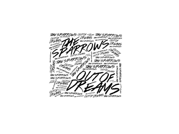
Developing New Digipak Design
I think the development on Design 3 is going successfully. The use of the scribble like font makes the idea look aesthetically pleasing but improvements could be made. I think the top quarter looks much more precise and pleasing than the rest and I think this is because of the more linear small text which is something I should consider for the rest of the cover.
Better.
ReplyDeleteLook at The Rolling Stones Beggars banquet and Exile On Main street to justify your choice of layout.